

Jan Trippner. A professional designer. A hobbyist illustrator.
“While commercial endeavours are usually collaborative work between the client and the doer…
…personal works give a deeper glimpse into one’s inner thoughts.
Works are somewhat divided by different techniques and approaches:
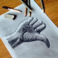
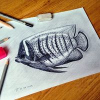
Techniques range from pencil drawings, through digital painting to vector illustration.
Subjects – from funny to sad, from unexpected to obvious.
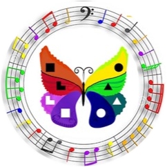
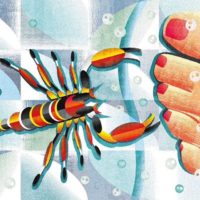
An example of this is the interpretation of the signs of the zodiac.
Symbolic meaning has been devoid of the mystical factor.”


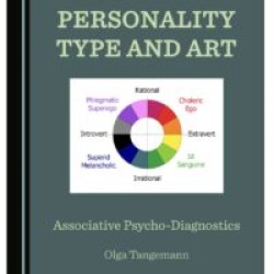
Typological analysis of Y. Trippner’s paintings:
If we look at colours and humour in pictures, then his art is closer to Id aesthetics. Very obvious statics, despite the fact that some of the pictures express movement. But this is a frozen movement as in the photo. And even in the photo movement can get blurry. And here there is no blurring, all lines are clearly drawn and separate objects and colours from each other.
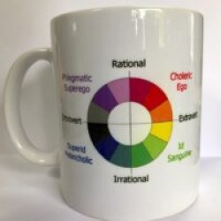
Irrationality is incomprehensibility or singularity. Rather unusual, but many pictures are nevertheless quite understandable. If we proceed from the principle proposed by Rainin, then extroversion (the brightness of the pictures) and statics together indicate irrationality.
If to correlate with mental functions, the intuition first of all strikes: Pictures made up, abstract, without detail. In some pictures, the road and the sky, which is often found in intuits, are noticeable.
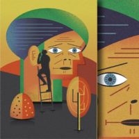
There is an easy choice between logic and ethics. There is no attention and interest in the experiences of people, their feelings. Facial expressions are absent or identical to pictures of animals. The artist is much more interested in objects and form, for example, an image of a hand and a finger raised to the top or a face made up of geometric shapes.
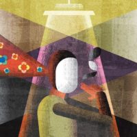
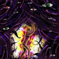
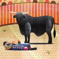
Let’s look at how the pictures of this artist with the leading function of Ti and how his art differs from the preferences and works of irrational types and, in particular, ILE and ILI. Take for analysis this picture on the left. It has an abstract idea, which is consonant with other works of the artist. It is darker in colour and can be safely attributed to the introversion and introverted Superid-Superego profile. To be a true art of Superid energy, it lacks even darker shades, the dynamics and sense of space … that reflect the functions of Ni and Si used together. There is no element of threat, tension and melancholy, horror stories and themes of death, typical for the preferred art of logical Super-types.
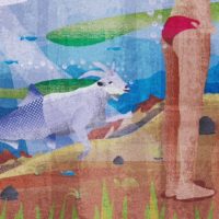
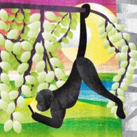
What does this art illustrate very well is how Ti is expressed in art compared to programme Ne. The artist put the accent on the orderly arrangement of objects and shapes. It has not got a volume or space, the images are flat and we see clearly overuse of geometrical shapes. It is more like he is playing with the form of the objects seeing them as symbols. It is very much “map” like art, schematic and reminds me of Egyptian art – drawings on the wall. Pictures of the irrational types are less orderly and have got the element of untidiness and disorder as if they do it on purpose – enjoying breaking the rules and destroying the shape of the objects by blurring and using some other technics. Remember the “crazy mirrors”. Some pictures though may fall neatly into irrational TPEs but if we look in general than we can notice the difference from the irrational art. An example of full compliance with the art of Superid would be this picture of the artist:


Recent comments